 I’m attempting to setup a Facebook page for a client of mine and I’ve discovered that the process of posting graphics is all but intuitive. I’ve never been a fan of Facebook in the first place, the layout is clunky, it’s very hard to navigate, find things etc. But hey, people use it like crazy so you got to be there if you are trying to appeal to a greater audience. First off I put up the cover photo.
  I was able to find a Photoshop template with the appropriate sizes that helped (you can get it here).Then there’s that little Profile picture, the one everybody sees when you post something. The size of the small square in the corner of your cover photo is 160×160, BUT, you are required to upload a photo no smaller than 180×180. I realized I should upload the best possible quality since it appears FB will compress it again. I noticed that my first attempt did not scale well down to the smaller thumbnail size for postings, so I redesigned it with white text on a black background, and I also stretched the text to fill the frame top to bottom.I soon discovered that was not ideal, on the notifications page, it cropped the top and bottom off the profile thumbnail to only show the middle, making the square into a rectangle.
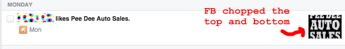 So now I’m back to redesigning the Profile picture again. Not a fan of Facebook!

FreedomDV
Cart total: $0.00